
Outline
- Why shoppers hesitate on product pages
- Definitions & scope
- What is AI for ecommerce sales?
- What is a website product Q&A assistant?
- What counts as “friction,” and how to measure it
- The most-asked pre-purchase questions by category
- Generating answers that convert (grounding, tone, transparency, recommendations, add-to-cart)
- Product-page UX that converts: research-backed Guide
- What’s next (multimodal, personalization, voice, agentic checkout)
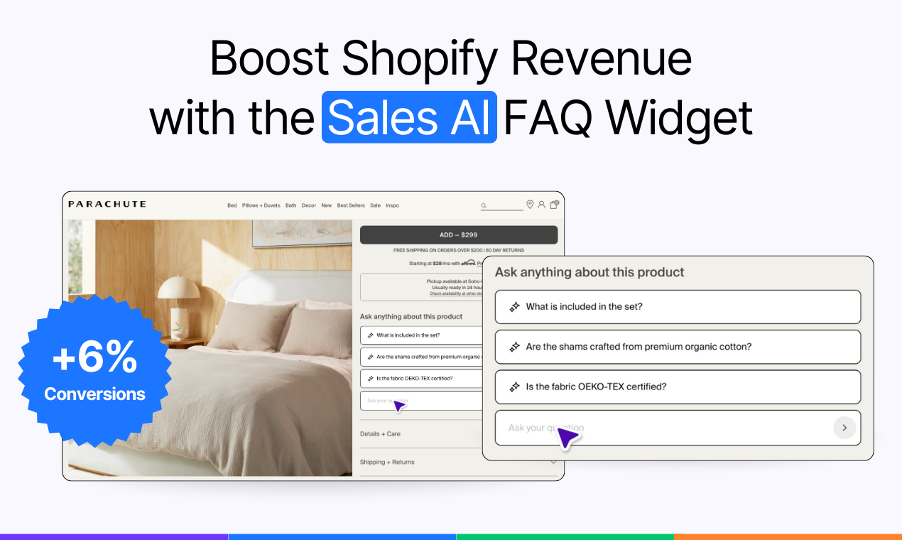
- About Yuma Sales AI: a website product Q&A assistant (why we built it; brief, non-promotional; details at the end)
- FAQs
1) Why shoppers hesitate on product pages
Most drop-offs are not dramatic. They come from small uncertainties that stack up until buying no longer feels like a good decision. Decades of ecommerce research list the same culprits: incomplete or buried information, weak imagery, unclear options, and policies that appear only after a shopper has already committed time and attention. Baymard’s large product-page studies and benchmark data repeatedly show that clarity about basics is the difference between interest and abandonment. (Baymard Institute)
Shoppers look for a few core signals before they add to cart: They want a clear product name, images they can inspect, a price that includes any extra charges, visible availability, options that are easy to choose, and an unmissable path to add to cart with immediate feedback. When any of these are missing or hard to find, hesitation rises. NN/g frames these as the minimum viable elements of a trustworthy product page. (Nielsen Norman Group)
Category context matters: Apparel buyers hunt for fit and sizing guidance that feels concrete rather than generic. Electronics shoppers look for compatibility and specs that map to their use case. Home and beauty shoppers want materials, ingredients, care, and return rules in plain language. Baymard’s research on product pages and DTC sites suggests that these details need to be present where the question occurs, not tucked into distant help content. (Baymard Institute)
Timing is as important as content: If a policy is only visible at checkout or a size chart hides behind a long scroll, it is effectively invisible. NN/g and Baymard both highlight find-ability and proximity as key principles. The page should answer the question at the moment it appears, which keeps momentum and reduces the mental cost of continuing. (Nielsen Norman Group)
The final source of friction is trust: Shoppers do not need flowery persuasion. They need evidence. That means consistent specs across variants, images that match options, accurate stock signals, and language that acknowledges uncertainty when it exists. Research-backed guidance favors honest, specific answers over confident generalities. When the page earns trust, decisions get easier. (Baymard Institute)
.png)
2) AI for Ecommerce sales, website product Q&A, and “friction”
AI for ecommerce sales
AI in this context means the practical use of machine learning and generative models to help shoppers decide and buy: answering questions, guiding choices, and removing uncertainty. It includes retrieval-grounded systems that can reference your own catalog and policies, and it includes analytics that help teams see what to improve. Adoption and reported value have been rising, especially in sales and marketing functions, but outcomes vary by execution. Treat it as a toolset, not a magic wand. (McKinsey & Company)
Website product Q&A assistant
This is a small module on a product page that lets a shopper ask a question, get an evidence-based answer from your data, ask a quick follow-up, and continue without leaving the page. Under the hood, the most reliable versions use retrieval-augmented generation. (arXiv)
The system retrieves relevant snippets from a vetted corpus such as product specs, size charts, and policy docs, then generates an answer that stays faithful to the retrieved sources. The point is not to sound clever. The point is to be correct and fast.
Friction
Friction is any gap that makes buying feel risky or confusing at the moment of decision. On product pages, research repeatedly traces it to missing or hard-to-find basics: clear name, inspectable images, transparent price and charges, visible availability, selectable options, and an unmistakable path to add to cart with confirmation. When these elements are incomplete or buried, hesitation grows and conversion falls. (Nielsen Norman Group)
How to measure
Use controlled experiments. Define exposure on the product page, track interactions with the Q&A, and attribute downstream adds-to-cart and purchases. A/B or A/B/n tests remain the clearest way to separate real lift from noise, provided the assignment is random, metrics are pre-declared, and statistical checks are in place. (Stanford Research)
3) The most asked pre-purchase questions by category
Shoppers’ questions cluster around risk. They want to know if the item fits their body or their use case, what happens if it doesn’t, and how long it will take to arrive. The stakes are visible in returns data and consumer studies, which consistently tie hesitation to sizing, specs, and policy clarity, especially online where return rates are higher than in store. (National Retail Federation)
Apparel
Most uncertainty lives in size and fit. In apparel, a McKinsey survey attributed roughly seventy percent of returns to poor fit or style, which signals how central concrete sizing guidance is at the moment of decision. That includes size charts that map to body measurements, photos that match variants, and plain-language care and return rules where people are deciding. Industry and policy work on returns echoes the point that better product detail and sizing tools reduce waste and disappointment. (McKinsey & Company)
- How does size M compare to Brand X’s sizing; what’s the chest/waist in cm/in?
- What is the inseam on 32/34 and the rise measurement?
- Is the fabric opaque when stretched and how should I wash it?
Beauty
Beauty buyers look for ingredient clarity, safety, and shade or result expectations. Recent industry research highlights rising demand for transparent ingredients and proof of efficacy, particularly among younger shoppers who expect to understand what is in a formula and why it works. Clear labeling, links to authoritative guidance, and honest expectations reduce second-guessing. (McKinsey & Company)
- Is this safe for sensitive skin or during pregnancy; any known irritants?
- What percentage of the active ingredient is in this formula?
- Which shade matches Brand Y shade Z?
Gadgets & Electronics
Electronics shoppers check compatibility, support, and warranty terms before committing. Academic work on warranties shows they function as risk reducers when buyers cannot verify performance in advance, and delivery expectations can influence both conversion and returns, which makes shipping options and reliability part of the decision calculus. Bring compatibility lists, required standards, and warranty coverage into view on the page. (ScienceDirect)
- Is this compatible with Device A/standard B; what protocols are supported?
- What’s the warranty coverage and how do I file a claim?
- How fast is delivery to my post code and are returns free?
Home & Furniture
In home categories, questions concentrate on dimensions, materials, finish accuracy, and assembly. Literature on online furniture experience and consumer satisfaction points to size fit within the space, realistic imagery, and the perceived effort of assembly as pivotal. Spell out measurements in multiple units, show scale and clearance, and make assembly steps and required tools obvious before purchase. (BioResources)
- Will this fit through a 30-inch doorway and my elevator dimensions?
- What are the exact measurements and clearances in cm/in?
- How long does assembly take and which tools are required?
Across categories, one pattern repeats. People want fast, specific answers in context, not a detour to long help pages. Google’s research on micro-moments captures this expectation for immediate help at the point of need, which is exactly where a grounded product Q&A assistant can play a practical role. (business.google.com)
4) Generating answers that convert (grounding, tone, transparency, recommendations, add-to-cart)
Good answers reduce uncertainty without adding effort. The goal is simple to say and hard to do: give a correct, specific answer in context, then let the shopper act. Usability research calls this lowering interaction cost. As Nielsen Norman Group puts it, “interaction cost is the sum of efforts, mental and physical, that users must deploy” to reach their goal, so our job is to keep that cost low. According to Nielsen Norman Group, that means minimizing extra clicks, context switches, and cognitive load. As we built Yuma's Sales AI, we applied these same principles so shoppers can stay on the product page, get evidence-based answers, and take the next step without friction.
Grounding: answer from your own sources
The most dependable systems pull from a vetted corpus such as product specs, size charts, and store policies, then assemble a response that stays faithful to those sources. Retrieval-augmented generation has emerged as a strong pattern because it “enhance[s] factual grounding, accuracy, and contextual relevance,” according to a 2025 systematic review of RAG research, which traces how retrieval steps reduce unsupported claims (arXiv).
Tone: write like a helpful teammate, not a brochure
UX writing guidance is consistent on three points. Be clear, be specific, and match the user’s context. Nielsen Norman Group frames microcopy as information that addresses people’s needs in the moment and warns against filler that sounds friendly but says little (Nielsen Norman Group). If a shopper asks about fabric opacity or compatibility, answer the question in one or two sentences, then offer a small next step they can accept or ignore. Clarity also serves accessibility; explicit labels help screen-reader users and reduce ambiguity for everyone. (W3C WAI)
Transparency: show your work just enough
People decide faster when policies and evidence are visible where doubt arises. Google’s Retail UX playbooks advise making delivery and return details obvious at decision points, and to “help users pay quickly and easily,” which implies removing detours that derail intent (services.google.com).
Recommendations: earn the right to suggest
If the answer reveals a mismatch, relevant alternatives can save the session. Personalization studies associate well-targeted suggestions with stronger revenue outcomes. McKinsey reports that companies with effective personalization “lift revenues by 5 to 15 percent,” though results vary and execution quality is the lever. McKinsey & Company uses this as a hypothesis to test, not a promise. Limit suggestions to one or two clearly different options and explain why they fit. Over-recommending adds noise and raises abandonment risk, a pattern Accenture links to overwhelmed shoppers who walk away when decisions feel effortful. (Accenture)
Add to cart from the conversation
Once a question is resolved, momentum matters. Let shoppers add the current variant to cart without leaving the page, then confirm visibly and keep their place. The benefit is not magic. It is fewer steps. By cutting a context switch, you lower interaction cost and reduce the chance that an answer journey turns into a tab maze. Nielsen Norman Group’s definition of interaction cost explains why this small detail often feels like a large improvement.
Guardrails that protect trust
A credible assistant prefers precision over persuasion. Cite knowledge sources when appropriate, keep variant data in sync with the page, and avoid confident generalities when the underlying data is thin. Google’s guidance for people-first content aligns with this posture. It rewards pages that explain benefits and limits plainly and that place helpful information where users need it. (services.google.com)
Generating answers is less about sounding smart and more about making it safe to decide. Ground responses, write for the moment, show enough evidence to earn trust, offer a relevant next step, and keep the shopper in flow.
For a broader view of how generative AI reshapes the full post-purchase experience, see the complete guide to gen AI customer service.
Pre-purchase intent → answer templates
| Intent | Required data | Answer template | Next step |
|---|---|---|---|
| Shipping time to [city or postcode] | Carrier zones, service levels, cut-off times | Standard delivery to [city] arrives in [X–Y] days. Order by [cutoff] for dispatch today. Source: Shipping policy, updated [date]. | View shipping options |
| Return policy for [category or SKU] | Return window, conditions, refund timing | Returns accepted within [N] days if [condition]. Refund to original payment in [X] days. Source: Returns policy, updated [date]. | See returns policy |
| Will size [M] fit [measurements] | Size chart with body and garment measures | For chest [A] and waist [B], size [M] gives [garment measure] for a [fit descriptor]. Source: Size Guide v[version], updated [date]. | Open size guide or add [size] to cart |
| Works with [device or standard] | Compatibility list, supported protocols | Compatible with [device or standard]. Supports [protocols]. Not compatible with [exceptions]. Source: Compatibility list, updated [date]. | View compatibility list or add to cart |
| Ingredients or pregnancy safety | Full INCI list, allergen notes, usage guidance | Contains [key actives at %]. Free of [allergens] per label. If unsure, patch test and consult a clinician. Source: Ingredients label, updated [date]. | View full ingredients |
| Delivery cost and free threshold | Shipping price rules, free-shipping threshold | Shipping is [amount] or free over [threshold]. Add [delta] more to qualify. Source: Shipping policy, updated [date]. | View shipping options or add to cart |
| Variant availability and ETA | Per-variant stock, restock ETA | [Variant] ships in [X] days or back in stock on [ETA]. Source: Inventory snapshot [timestamp]. | Choose another variant or get restock alert |
| Assembly time and tools | Steps, tools, estimated time | Assembly takes about [minutes]. Tools needed: [list]. Source: Assembly guide v[version]. | Download assembly guide |
| Shade match to Brand Y shade Z | Cross-brand shade map, undertone notes | Closest match to [Brand Y shade Z] is [Our Shade] with a [undertone]. Source: Shade map v[version]. | See shade photos or add [shade] to cart |
| Warranty coverage and claims | Warranty length, covered parts, claim steps | Warranty is [length]. Covers [components]. Start a claim at [link]. Source: Warranty terms v[version]. | Start claim |
| Materials and care | Material composition, care instructions | [Material]. Care: [instructions]. Expect [shrinkage or none]. Source: Care guide, updated [date]. | View care guide or add to cart |
| Will it fit through a doorway or elevator | Package and unboxed dimensions | Largest box is [L x W x H]. Fits through a [door width] doorway. Source: Packaging specs, updated [date]. | View dimensions |
5) Product-page UX that converts: research-backed guide
Strong AI answers work best on a strong page. The foundation is well-known: complete information, findable options, clear pricing, visible availability, and an unmistakable path to buy. Nielsen Norman Group lists these as the minimum viable elements for a trustworthy product page, including enlarged imagery, option selection, availability, and clear add-to-cart with feedback (Nielsen Norman Group). According to Baymard Institute’s large product-page studies, many sites still miss basics like policy clarity and spec completeness, which drives hesitation (Baymard Institute).
Use this short checklist to evaluate your product pages:
- Product basics above the fold: descriptive name, zoomable images, price including any extra charges, visible availability, and a prominent add-to-cart with immediate confirmation; NN/g shows that explicit “added” feedback reduces uncertainty. (Nielsen Norman Group)
- Options that prevent errors: size, color, and other variants shown with clear states and no hidden defaults; rely on concrete specs and size guides rather than vague fit language; Baymard documents frequent failures here. (Baymard Institute)
- Policy visibility in context: shipping speed, costs, returns, and warranty near price and CTA, not only in Help; keep timestamps fresh per Google retail playbook recommendations. (services.google.com)
- Mobile and performance: pages should feel instant and stable; aim for good Core Web Vitals on loading, interactivity, and visual stability to reduce “wait” friction. (Google for Developers)
These fixes stand on their own. A website product Q&A assistant such as Yuma Sales AI fits into this structure, not replace it: answer precisely from your data, keep the shopper on the page, and let them act without extra steps.
Product-page essentials checklist
| Element | What good looks like | Evidence |
|---|---|---|
| Title and summary | Clear product name plus a one line value statement near images and price | NN/g |
| Image gallery | High resolution images, zoom on hover or tap, variant specific photos, optional video | NN/g, Baymard |
| Price and total cost | Price near title, taxes and fees clarified before cart, promo applied visibly | NN/g |
| Options and variants | Explicit states for size or color, no hidden defaults, prevent invalid combos | Baymard |
| Availability | In stock or back order status next to selector, realistic delivery window | Baymard |
| Add to cart CTA | Prominent button above the fold, immediate confirmation, stays in context | NN/g |
| Delivery and returns | Shipping speed and cost, returns window and method visible near price and CTA | Google Retail Playbook |
| Sizing or specs | Size chart mapped to body or device measures, specs tied to variants, plain language | Baymard |
| Policy clarity | Warranty, care, and ingredients linked in context with last updated date | NN/g |
| Reviews and proof | Authentic reviews with filters, avoid dark patterns, highlight common Q&A | Baymard |
| Mobile layout | Thumb reachable selectors, sticky CTA, stable layout on load | NN/g |
| Performance targets | LCP ≤ 2.5 s, INP ≤ 200 ms, CLS ≤ 0.1 on key product templates | Google CWV |
| Accessibility basics | Labels on controls, contrast ≥ 4.5:1, target size about 24x24 CSS px, image alt text | WCAG 2.2 |
| Assistant placement | Q&A entry near options or size, answers inline, provenance shown when useful | NN/g, Baymard |
6) What’s next: multimodal, personalization, voice, agentic checkout
Shopping is getting more conversational and more visual. Search is moving toward mixed inputs where people type, speak, and point a camera at what they want. Google’s own Search blog says AI Mode brings “more advanced reasoning and multimodality,” and it is rolling out beyond Labs in 2025 (blog.google).
Virtual try-on is crossing from novelty to utility. Google’s shopping team describes a new try-on that works with your own photos and a model that understands how fabrics drape on different bodies. (blog.google)
Retailers are deploying conversational shopping assistants at scale. Amazon made Rufus available to all U.S. customers in the app and on desktop to answer product questions and help people decide (About Amazon).
Personalization will feel less like a block of recommended tiles and more like a thread that adapts to intent. McKinsey’s research continues to link effective personalization to revenue lift, while noting that outcomes depend on data quality and design. (McKinsey & Company)
A notable shift is “agentic checkout.” Google’s marketing guidance describes a flow where a shopper tracks a product’s price, sets options, and then approves a “buy for me” action that completes the purchase with stored payment. The agent does work that used to require multiple visits, while the person stays in control of the final confirmation. (Google Blog)
What this means in practice:
- Design for mixed inputs. Make specs, policies, and variants parseable by both people and machines so answers remain faithful whether the question arrives by text, voice, or camera.
- Show provenance. If an answer is based on a size guide or warranty PDF, say so. This will matter even more as assistants intermediate shopping.
- Keep consent front and center. Agentic patterns like price tracking and auto checkout need clear opt-ins and easy reversal.
- Instrument everything. If you adopt these features, measure exposure, interactions, adds to cart, and purchases with controlled tests so you can separate real gains from noise.
This roadmap aligns with how we continue to evolve Yuma Sales AI. We started with grounded answers on the product page. Next comes richer experiments with agentic steps that respect consent and keep shoppers in control.
7) About Yuma Sales AI: Why we built a product Q&A widget
We kept seeing the same pattern in ecommerce support: a surprising share of “support” messages were actually pre-purchase questions that should have been resolved on the product page. The buyer was inches from adding to cart, then hesitated about fit, materials, shipping, returns, or availability. Our question became simple: could we answer those questions right there on the page, without sending people to a Help Center or email thread, and could we measure whether it helped?
What it is
Sales AI is a website product-Q&A widget that lives on your product pages, suggests likely questions, answers from your own sources, supports quick follow-ups (and recommendations), and lets shoppers add to cart without losing context.
Design principles
- Grounded, not generic. Answers come from your product data, policies, and existing help content — not from guesswork.
- Honest confidence. If we’re unsure, we say so and point to the canonical source (size chart, policy, or human help) rather than bluff.
- Stay in flow. Keep the shopper on the page; no detours to slow queues or dead-end FAQs.
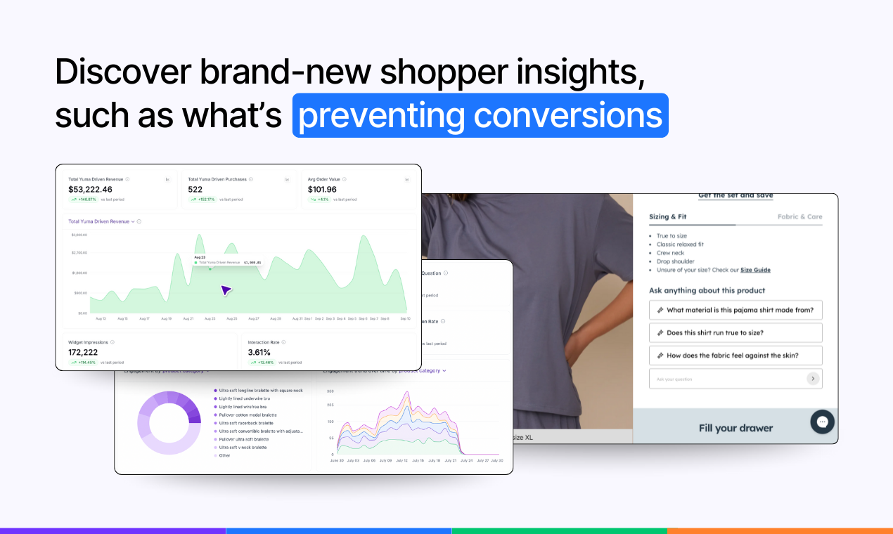
- Measurable by default. Instrument interaction → add-to-cart → purchase so you can A/B it with your own framework. Treat lift as a hypothesis to test, not a promise.
- Performance-aware. Lightweight script, mindful of speed budgets and mobile UX.
- Privacy-first. Use only what’s needed to answer the question; clear boundaries for data retention.
What it’s not
- Not a generic pop-up chatbot that ignores product specifics.
- Not a black box—you can inspect conversations and the sources used to answer.
- Not tied to one platform: it works with Shopify.
- Not a re-platforming exercise; it layers onto your existing stack and A/B tools.
Where it fits in your workflow
You install it, point it at the right sources (product details, policies, existing macros), and choose where it appears. From there, you watch the questions people actually ask, ship copy or policy fixes, and iterate on answer style and depth.
If you want to see what's included, explore Yuma's pricing options before you book a call.
8) FAQs
What is a website product Q&A widget and how is it different from a chatbot on my website?
A website product Q&A widget sits on the product page, answers from your own catalog and policies, supports quick follow-ups, and lets shoppers act in place. A generic chatbot lives in a floating window, often lacks product grounding, and sends people to help pages or email. The widget is purpose-built for product decisions, not general support.
Where on the product page should answers appear to reduce drop-off?
Place the entry point near the decision controls, typically by size or option selectors and price, and keep answers inline so the page context stays visible. Show delivery and returns details where the doubt occurs, not only in Help. This aligns with research that proximity and find-ability lower abandonment on product pages.
Which data sources should power answers and how do we keep them up to date?
Use product specs and variant data, size or fit guides, ingredient or material sheets, compatibility matrices, shipping and returns policies, warranty terms, and inventory or ETA. Sync from your commerce CMS, add timestamps and version labels, and set an owner and review cadence so updates propagate without manual copy-paste. Clear provenance helps trust and maintenance.
How does an LLM keep answers accurate on product pages?
An LLM retrieves the most relevant snippets from a vetted corpus, then generates a concise answer constrained by those sources, which reduces unsupported claims. Show the source label and last updated date when useful, and set a confidence threshold so the system only answers when retrieval is strong.
What should the AI do when it is not confident or data is missing?
Abstain gracefully, show the closest canonical snippet, and offer a simple next step such as opening the size guide, viewing the returns page, or contacting support. Log the gap so your team can add or fix the missing data. This protects trust and turns uncertainty into a content improvement queue.
Which KPIs should we track beyond conversion rate?
Watch interaction rate with the assistant, add-to-cart rate per exposed session, purchase rate per exposed session, and time to first decisive action. If you surface recommendations, track assisted revenue and AOV deltas. These give a fuller picture than a single conversion number.
Will an AI Q&A module slow down my website and how do I verify performance?
It should be lightweight and load asynchronously. Use PageSpeed Insights or Chrome DevTools to test before and after, and check that the module does not block rendering or shift layout. If metrics slip, defer noncritical assets, lazy-load heavy media, and keep the DOM footprint small. See Google’s Core Web Vitals documentation.
How should we handle accessibility and multilingual answers on product pages?
Meet WCAG 2.2 basics: sufficient contrast, labeled controls, keyboard access, and clear focus states. Announce answer updates for screen readers with a polite live region and keep language simple. For multilingual stores, detect the page language, prefer first-party translations of sources, and fall back conservatively. Let users switch language and show provenance so they know which source the answer came from.
Can product recommendations increase average order value and how should they be constrained?
They can help when they follow intent. Use the answer context to suggest one or two clearly relevant items, explain why they fit, and avoid pushing out-of-stock or near-duplicates. Measure average order value per exposed session with a holdout and keep suggestions conservative so they aid decisions rather than add noise.
How do we prevent hallucinations or wrong answers about variants and availability?
Ground answers with retrieval from versioned sources, set confidence thresholds, and abstain when retrieval is weak. Keep variant data and inventory in sync with the page, show provenance and last-updated timestamps, and route edge cases to a human path. Review samples regularly and treat missed answers as a content backlog.


